I've had this logo idea in my mind for a couple of years, as I have always wanted something to represent me as a person. I wanted a simple logo as I'm not sure which creative field I would like to go into in the future. My first thought was to make a yellow base, as yellow is my favorite color is yellow and I feel it represents me. But unfortunately yellow is a difficult color to incorporate into a logo. I played with multiple colors and decided to settle on a gradient from pink to peach. I also played around with the size to see how it would look on a smaller scale, and thankfully it still looked good.
Process
Sketching was a confusing process. I had an idea that I thought was the best of the bunch. It was a gorgeous geometrical rose with my name worked into it. When I pitched my logo to the teacher I was told there were too many lines. I was insanely let down because I had such high hopes for that logo. But I quickly regained confidence and stuck with the logo I’ve had in mind for a while. Creating my logo was surprisingly easy, which made me happy. Its simply a circle and a few lines. Im glad it wasn’t difficult to create because that means I can replicate it.
Explanation
Again, when creating my logo I wanted it to be simple and easy to recreate. At first I wasnt going to add color but I felt the stark black was too elegant for me and my style. I immediately started playing with yellows and pinks and gradients, then I quickly landed on a peachy pink gradient. I adore how bright and happy my logo looks, and I’m very pleased with the overall design.
This weeks project was to take a deconstructed theatre poster and put it back together using CARP.
Subheading
Contrast is the first step. I wanted to make the decal bold, along with the title. Part of me wants to go back and change the decal to white, but a hard part about being a graphic designer is knowing when to stop. I added the red details to tie together the theme of Dorothy's ruby red slippers. I also wanted to point out the main goal for each of the characters. Dorothy wants to use her ruby shoes to get home. The tin man wants to love, he wants a heart. The scarecrow wants knowledge; a brain. And the king of the jungle wants courage.
Allignment
Alignment came second. I'm not too pleased with how I aligned the "fine print". I love the way the title looks but I feel like I could do better than central alignment. I know central alignment looks good in some places and I hope to god it looks good here (my confidence is wavering).
Repetition
After alignment is repetition. At last minute I changed the font from black to white, but I didn't continue that down to the decal. I should have at least added some black text to make it more constant. I know I could have done better with repetition. Though I am glad I added a pop of color to draw people's eyes to the page.
Proximity
Lastly is proximity. I didn't spend as much time on proximity as I wish I had. The text is awkwardly grouped together and the sizes are everywhere. I wish I had been more consistent. As much as I've torn apart this poster, I don't despise it's end result. I just know there is room for improvement.
The project we were assigned was a typography diagram. Our motive was to type our name in a serif font and label it accordingly. We learned about the different heights ( Baseline, X-Height, and Caps Height ) that made up a font. We then discovered the parts of a serif font that make it unique ( Beak, Counter, Axis, Etc. ). Once we had the knowledge we needed we were able to begin our project.
What I Learned
I wasn't aware that there were names for everything when it came to fonts. Graphic designers go into so much depth in terms of creating a font, making this section thinner, this section sharper, and this section rounder. The people put so much effort into creating a font that represents a specific mood. Kudos to graphic designers for being so detailed.
My Experience
I found this project quite easy. Handling the tools and arranging the text wasn't difficult but I struggled with labelling. The text is just so unbelievably uneven on either side and it irritates me greatly. And I wanted to do a different color like a soft pink or a baby blue to stand out against my yellow theme but it wouldn't fit since I don't have any colored accents on my blog. I plan on changing that as soon as possible so my blog isn't so bland.
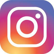
This logo uses the analogous colors of yellow, yellow-orange, orange, red-orange, red, red-violet, and violet. I think the company chose these colors to display variety and diversity in their app.
This logo uses the analogous colors of green, yellow, and blue. I think the company used these colors to enforce growth, renewal, and trust.
Complementary
This logo uses the complementary colors of orange and purple. I think the company did this to portray energy, balance, and nobility.
This logo uses the complementary colors of orange and blue. I think the company chose these colors to give off an energetic, exciting vibe.
Warm
This logo uses the warm color red. I think the company used this color to represent passion and energy. This logo uses the warm colors of red and yellow. I think the company used these colors to show optimism and passion.
Cool
This logo uses the cool color blue. I think this company used this shade of blue to represent technology and ambition.
This logo uses the cool color blue. I believe the company used this blue to showcase their technology and trust.
Monochromatic
This logo uses the monochromatic color blue with a lighter and darker ombre. I think this company used these colors to showcase technology and intellect.
This logo uses the monochromatic scale of the color brown. I believe they used this color to express wholesomeness and warmth.
Triad Color
This logo uses the triad colors of red, yellow, and blue. I think this company used these colors to represent hope, energy, and spirit.
This logo uses the triad colors of red, yellow, and blue. I think this company chose these colors to show energy, optimism, and ambition.
Our first project of second quarter was to create a color wheel in Adobe. In graphic design, colors are a key part of creating an appealing image. Thankfully, Mr. Olson went through all of the tools and shortcuts and made this project quite easy. And not only did he show us what every tool does but I have past experience in programs that have a similar set-up.
WHAT I LEARNED
I learned a lot! I was worried about adjusting the size of images without warping them, but luckily there's a shortcut to prevent image warping. I also learned how Adobe's membership (?) works, as I always wanted to work with this program but I knew it was expensive. Working with this program wasn't too difficult and I look forward to working with it more in the future.
RESULTS
The final product was exemplary, though I do wish I spent more time on the text. The heading is awfully close to the top and even I'm anxious for it. I had a lot of fun messing with the color square, desaturating and blending colors together to get the perfect hue. I want to go back and make some of the lines thicker so they are more eye-catching, but other than that and the text I'm happy with the results.
In my past films, I struggled to use the six-shot system. I would constantly forget shots and merge the videos in an awkward order. After filming for a little while and "mastering" the program, I now understand how to cut and transport my shots and combine them in a fluid sequence. After leaning these skills I've been able to point out filming techniques while watching movies or shows. I gather ideas from those films and use them to improve my videography.
Me and my partner completed sketching awfully quick. We both had an idea of what we wanted to do and were very flexible with each others opinions. Our plan was to showcase a late student who is making their way to class, and I believe the final result turned out phenomenal. I'm glad I chose Ella as my partner, she was very cooperative when it came to brainstorming and acting. I hope to work with her again in the future.
Working in premier came naturally to me. I've worked with multiple different programs and I understand the basic layout, so finding the tools I needed wasn't very difficult. I believe in this project I complied the shots in a much more pleasant sequence this time around, though that doesn't mean there aren't any consistency issues. If I could, I'd change the location of the camera in a few of the shots to make the transitions more fluid. Unfortunately, ISMfilms was not working, so I had to use an audio file from our last project. It's not my favorite, but I think I was able to make it work.
As the school year progresses and the initial chaos of the first few weeks has simmered down, E-Communication hour two jumps into video. The class was divided into groups and handed a layout to start planning six shots for our short film. Our goal was to inform incoming freshmen and teacher's how to print documents using the six shot technique, including the wide shot, medium shot, and close up.
My role in this project was leader. My group was awfully rowdy and I had to take the lead multiple times. I created the storyboard while they chatted, retrieved the technology to film since I was the only one with a signed tech sheet, and directed our actor to where he should be instead of causing trouble with another teammate.
When I first got onto the editing program I was terrified. Everything was new and pristine. I uploaded the files, got them in order, and muted the audio. Once I finished, I was more comfortable with the program. Since I had time I played around with the tools, understanding how to undo, add text, and move files. The hardest part for me would have been trying to find a song for the video. It's difficult to capture the mood of a film in a song, especially when you can't name it.
Personally, I think I succeeded at leadership, though I am biased. My team struggled with collaboration and communication, but we made up for it in project management. If I could do anything different, I would be more strict. I would put my foot down and say no to my teams' behavior. Just because we don't work well together does not mean we don't have a project to finish. I would also take more shots, and check to make sure the lighting is consistent, because when I merged the videos I noticed a few shots had a yellow hue.
Although this wasn't my favorite activity, I'm glad we did it. I was able to educate myself with the programs and technology throughout filming and editing. Hopefully my next group won't be too reckless, but even if they are I will gladly step up and take the leadership role again.
Our first project in the E-Communications program was to meet with the different classes, split into teams, and create symbols that related to people in the group. The overall goal was to come up with a Code of Arms that included everyone's symbols. We had the whole period to start sketching, then we would put our ideas onto the concrete.I was able to meet people from different E-Comm classes and learn what their goals for the year were. I got to see what their hobbies and specialties were. This activity was very fun, for I was able to make friends with people who had different interests. We all had a part when it came to creating our Code of Arms, we were all involved. During the hour we recreated our symbols with chalk, we all bonded. There were no arguments in our group, we all talked and discussed each others opinions. For our Code of Arms we went with a simple but recognizable shape. We split the shield into fourths to showcase our symbols, and we draped a ribbon in the center to state our names. We used a limited collection of colors to prevent the shield from being too complicated. For the individual boxes we made sure to use colors that contrasted against the symbols so that they'd stand out, as they are the main focus. For our symbols we used stereotypical objects. As an artist, the symbol I chose was a paintbrush. Painting isn't my preferable method but it is the most obvious symbol that describes creativity and art. We had a baseball player, a dancer, and a cheerleader, so coming up with symbols for all of us wasn't too difficult.
Our finished product.
When we all came together to draw our shield on the cement, we were oddly quiet. Everyone knew their job and they knew what to do. The silence didn't make it any less enjoyable, though. In the end I believe our outcome was very pleasant. The colors weren't hard on the eye, the details were beautiful, and I think my team worked wonderfully together. I look forward to doing more group projects as the year progresses.


 I've had this logo idea in my mind for a couple of years, as I have always wanted something to represent me as a person. I wanted a simple logo as I'm not sure which creative field I would like to go into in the future. My first thought was to make a yellow base, as yellow is my favorite color is yellow and I feel it represents me. But unfortunately yellow is a difficult color to incorporate into a logo. I played with multiple colors and decided to settle on a gradient from pink to peach. I also played around with the size to see how it would look on a smaller scale, and thankfully it still looked good.


 This logo uses the warm colors of red and yellow. I think the company used these colors to show optimism and passion.
 This logo uses the cool color blue. I think this company used this shade of blue to represent technology and ambition.
 This logo uses the triad colors of red, yellow, and blue. I think this company chose these colors to show energy, optimism, and ambition.


